In recent years, there’s been a ton of packages released in R for working with and visualizing spatial data that have eliminated my need for things like ArcGIS. Here’s how I use a few of them.
At RStudio (Posit) Conference this year, I realized I’d been dealing with a bit of impostor syndrome while sitting at a Birds of a Feather table for folks interested in spatial data. As I sat there, I started asking people about their spatial work and had largely assumed people knew more than I did. In part, this is because I’ve learned so many things from folks sharing through the #rstats hashtag on twitter and assumed people at the conference were just all farther down the line in the development of their skills than I was.
The reality was that most folks at my table were there because they were interested in learning how to work with Spatial Data in R and I was the only one at my table who had experience and background making maps, so folks asked for some resources and direction on how to get going with Spatial Data in R. For those at the table, I gave a very impromptu demo and walk through of core tools in my spatial workflow that a lot of people liked. Afterwards, some folks asked if I could share resources. So this post (or possibly series of posts?) is a first response to that.
At the core of my imposter syndrome was assuming folks already knew most of the stuff I did and, therefore, there wasn’t much of a need for me to share. So, at least with regards to spatial data, I’ll try to be better about contributing to folks in the #rstats community online by sharing about different things. Anyway, here we go.
First Question: Can you do any Spatial/GIS Work in R?
Yes.
Second Question: Are R tools any kind of good for Sptial/GIS workflows?
Absolutely. Positively. Definitively, yes. R is fan-freaking-tastic for a ton of random stuff, but it is especially amazing when it comes to spatial work. In fact, one of the reasons I’ve come to love R so much is how simplified workflows are, regardless of how complicated the data may be.
I often think back on a grad school GIS Course in 2017, where I first learned how to make maps. The workflows involved downloading separate spatial/numeric data files and required multiple pieces of software1 and hours of time to join those data, design the map, and export that map to a format you could use in a report or public-facing document. And that was really only static maps that end up in printed or PDF reports. Interactive workflows was an entirely different beast that required even more expensive software and other skills.
In contrast, consider the map below, which is built in this document. The code chunk at the very bottom of the document is what produces this map. It pulls the spatial and numeric data from its source (NCES Open Data) and visualizes it in about 10 lines of code. 🤯
More impressive is that, even though it contains over 100,000 school locations across the country, it’s very fast. Use your mouse/track-pad to hover the dots and zoom in-and-out.
How you do this in R | Feat. {rdeck}
To do this in R, it’s pretty simple. First, you go to the website where the data lives. Ironically, it’s on ArcGIS’s publishing platform, which lets us know there’s too many data points to display without zooming in. The good news is you don’t need ArcGIS to use the data.
Anyway, to use the data, you just click on the gold-colored “I want to use this” button at the bottom of the left-hand sidebar in the Step 1 screenshot. Once you’ve clicked on that, copy the URL from the “GeoJSON” link under “View API Resources”.
Step 1: Screenshot of NCES School Locations Data (Click to expand)
Step 2: Screenshot of NCES School Locations Data (Click to expand)
Once you’ve copied this code, you can read that spatial data directly into R with a function called read_sf() from the sf package. Once you read that url into read_sf(), you can drop any empty spatial data from the geometry column (where all the spatial coordinates live for each dot) and then give the map a standard CRS to use across all dots.
If you’re not familiar with sf, it’s what convinced me that, for the rest of my life, I never needed to pay for GIS software.
Here’s what this looks like as code, and it’s just seven lines of code. You run this, you get the data, and now you’re ready to move on.
library(tidyverse)# Core R Toolslibrary(sf)# Core Spatial Package. Pretty much replaces ArcGIS for most spatial tasks.sf::sf_use_s2(FALSE)url<-"https://services1.arcgis.com/Ua5sjt3LWTPigjyD/arcgis/rest/services/Public_School_Location_201819/FeatureServer/0/query?outFields=*&where=1%3D1&f=geojson"data<-read_sf(url)|>drop_na(geometry)|>st_as_sf(crs =st_crs(4326))
At this point, we are ready to map the data. Now, there’s lots of spatial packages out there to map with like {leaflet}, {mapview} , {mapdeck}, {tmap}, and {leafgl}, but I’ve recently become a huge fan of an R package called {rdeck}. I’m partial to it because it’s incredibly lightweight and the maps look really great once you’ve gotten a token from mapbox studio, even though you don’t necessarily need one.
For more on getting a mapbox token, see Kyle Walker’s tutorial from his {mapboxapi} R package.
So how do we map in {rdeck}? Well, let’s pretend like you didn’t have a mapbox token. You could start by running a code chunk, like the one below, which has two functions from {rdeck}.
The first function, rdeck(...) is kind of like the ggplot() function. It creates a spatial canvas, which you can modify with a few arguments. In this case, we’ve articulated that there’s no base map, but the overall theme of the map is “light”.
The second function, add_scatterplot_layer() is what we use to add the dots and define characteristics about them. In this case, it just adds the school dots, names the dot series “Public Schools (SY21-22)”, and tells it where to get the dots from within our dataset (the column labeled geometry)
The map above is a decent start, but there’s a couple of issues to resolve:
The dots kind of disappear as you zoom in.
The default bounding box is set more far out than I’d like.
I also can’t really see any information about the schools.
The lack of a basemap may not be a problem for some maps, but for this one… it’s just not great.
To fix this, we just add a few arguments to each of the two functions used in the previous code chunk.
Styling our dots
First, I’m going to style the dots. They look cool from far away, but appear to dissolve once you zoom in. This is the opposite of what we want if our goal is to let people explore the US and identify schools across the country. So, to fix this, we can use a couple of arguments within the existing add_scatterplot_layer() function.
We start by setting a minimum pixel size for the dots using radius_min_pixels. Leaving it blank will mean there’s no minimum as people zoom in. Setting it to 1 or 2 pixels will mean people will see a dot equivalent to those sizes no matter how far they zoom in.
I’m also going to make the dots burnt orange, cause I’m a UT Austin alum 🤘 and think it’s a great color 😂. Lastly, I’m going to set the opacity of the dots. There’s some other arguments within the function you can play with, but I feel pretty good about these dots. They are visible and big enough to hover over with a mouse.
At this point, we only need to add a basemap, tooltip, and bounding box so the map doesn’t render so far out (leaving a lot of white space).
Adding a tooltip is actually pretty easy and the pre-built tooltips are quite nice. In my code chunk, I’m going to adjust the existing data argument already set to our school_sites object and select only the Name and Location columns. They’re named differently, but I can rename them with school_sites |> select(Name=NAME, Location = NMCBSA). After this, you add a tooltip argument to define what columns you want. A nice feature of the tooltip argument is that you can use tidy-select syntax to build your tooltip. Lastly, I add pickable = TRUE, which just means that the dots will respond as I move my mouse/trackpad around the map.
If you want, you can add some CSS afterwards, but it’s a little complicated to adjust and the default tooltips are easy to set and look good. Alright, onto basemaps and bounding boxes.
Adding a basemap is easy once you get your token setup. Instead of setting map_style = NULL inside therdeck() function we’re currently, we just use one of the options from mapbox built into rdeck. For demonstration purposes, I’ll use a style from mapbox called “Le Shine” by setting map_style = mapbox_gallery_le_shine(). In the original map, we use a style called “Minimo”, which I like and think works well to contrast basic geographic markers alongside the kind of dots we’re trying to visualize.
Honestly, this one is kind of tricky and might be the least intuitive part of rdeck because the argument that controls this initial_bounds requires an object of st_bbox, sf, sfc class. The end result spits out a box of coordinates that looks like this:
The disclaimer here is that you don’t have to set a bounding box to adjust the view, but it certainly helps if you want to direct your audience to a specific location. I sort of hacked my way through this by piece-mealing a frankestein function of different things I found online called get_bbox(), largely based on Bob Rudis’ {nominatim} package. I’ve folded the code here, but feel free to look at if you want. The bottom line is it works, so just steal it and use it to get the bounding box you need for this argument.
In my case, I’m from Texas. I love Texas. And I want to focus the map on Texas. Not just cause I love it and am from here, but Texas is home to a significant chunk of America’s school-aged children. Of the reported 49.5 million children enrolled in US public schools, Texas accounts for over 5.4 million of them. So, I’m going to pass the result of my get_bbox() object into the initial_bounds argument of the rdeck() function, which will set the starting point to Texas.
It’s worth mentioning that some of the software required for the described GIS workflows requires using Windows and costs a ton of money.↩︎
Source Code
---title: "A Spatial/GIS Workflow for Interactive Maps in R"description: | In recent years, there's been a ton of packages released in R for working with and visualizing spatial data that have eliminated my need for things like ArcGIS. Here's how I use a few of them.author: - name: Matt Worthington url: https://twitter.com/mrworthingtondate: 2022-09-29page-layout: fullformat: html: date_format: medium css: page_header.css fig-width: 8 toc-depth: 3 warning: false message: false code-fold: true code-tools: true code-link: truetitle-block-banner: truetitle-block-banner-color: "#ffffff"image: andrew-neel-1-29wyvvLJA-unsplash-2.jpgcategories: - Spatial Data - GIS - Mapping - sf - rdeckfilters: - lightboxlightbox: auto---## Sharing is CaringAt RStudio (Posit) Conference this year, I realized I'd been dealing with a bit of impostor syndrome while sitting at a Birds of a Feather table for folks interested in spatial data. As I sat there, I started asking people about their spatial work and had largely assumed people knew more than I did. In part, this is because I've learned so many things from folks sharing through the #rstats hashtag on twitter and assumed people at the conference were just all farther down the line in the development of their skills than I was.The reality was that most folks at my table were there because they were interested in learning how to work with Spatial Data in R and I was the only one at my table who had experience and background making maps, so folks asked for some resources and direction on how to get going with Spatial Data in R. For those at the table, I gave a very impromptu demo and walk through of core tools in my spatial workflow that a lot of people liked. Afterwards, some folks asked if I could share resources. So this post (or possibly series of posts?) is a first response to that.At the core of my imposter syndrome was assuming folks already knew most of the stuff I did and, therefore, there wasn't much of a need for me to share. So, at least with regards to spatial data, I'll try to be better about contributing to folks in the #rstats community online by sharing about different things. Anyway, here we go.## First Question: Can you do any Spatial/GIS Work in R?Yes.## Second Question: Are R tools any kind of good for Sptial/GIS workflows?Absolutely. Positively. Definitively, yes. R is fan-freaking-tastic for a ton of random stuff, but it is especially amazing when it comes to spatial work. In fact, one of the reasons I've come to love R so much is how simplified workflows are, regardless of how complicated the data may be.I often think back on a grad school GIS Course in 2017, where I first learned how to make maps. The workflows involved downloading separate spatial/numeric data files and required multiple pieces of software[^1] and hours of time to join those data, design the map, and export that map to a format you could use in a report or public-facing document. And that was really only static maps that end up in printed or PDF reports. Interactive workflows was an entirely different beast that required even more expensive software and other skills.[^1]: It's worth mentioning that some of the software required for the described GIS workflows requires using Windows and costs a ton of money.In contrast, consider the map below, which is built *in this document*. The code chunk at the very bottom of the document is what produces this map. It pulls the spatial and numeric data from its source ([NCES Open Data](https://data-nces.opendata.arcgis.com/datasets/nces::public-school-locations-current-1/explore?location=34.278677%2C-96.594959%2C4.67 "National Center for Education Statistics: Public School Locations - Current")) and visualizes it in about 10 lines of code. 🤯More impressive is that, even though it contains over 100,000 school locations across the country, it's very fast. Use your mouse/track-pad to hover the dots and zoom in-and-out.```{r load-packages}#| echo: falselibrary(tidyverse)library(tidycensus)library(rdeck)library(sf)options(tigris_use_cache =TRUE)sf::sf_use_s2(FALSE)get_bbox <-function(place) { df_bbox <- nominatim::bb_lookup(place) btlr <- df_bbox[1,c("bottom", "top", "left", "right")] v <-as.numeric(btlr) cmat <-matrix(v[c(3, 3, 4, 4, 1, 2, 1, 2)], nrow =4) spobj <- sp::SpatialPoints(coords = cmat) sfobj <- sf::st_as_sfc(spobj) sf::st_crs(sfobj) <-4326 bbox <- sf::st_bbox(sfobj) bbox}austin_bbox <-get_bbox("Texas")``````{r import-schools-data}#| echo: false# data <- read_sf("https://services1.arcgis.com/Ua5sjt3LWTPigjyD/arcgis/rest/services/Public_School_Location_201819/FeatureServer/0/query?outFields=*&where=1%3D1&f=geojson") |># drop_na(geometry) |># st_as_sf(crs = st_crs(4326))# # qs::qsave(data, "raw_data/public_school_locations.qs")# school_sites <- qs::qread("raw_data/public_school_locations.qs")# school_districts <- tigris::school_districts(cb = TRUE) |> # drop_na(geometry) |># # drop_na(estimate) |># st_transform(4326)# school_districts <- tidycensus::get_acs(# geography = "school district (unified)",# variables = "B19013_001",# geometry = TRUE,# cb =# year = 2020# )# mapview::mapview(school_districts)# qs::qsave(school_districts, "raw_data/public_school_districts.qs")# # school_districts <- qs::qread("raw_data/public_school_districts.qs") |># drop_na(geometry) |># drop_na(estimate) |># st_transform(4326)``````{r rdeck-schools-example}#| echo: false#| column: page#| fig-height: 6rdeck(map_style =mapbox_gallery_minimo(),initial_bounds = austin_bbox,theme ="light") |>add_scatterplot_layer(data = school_sites |>select(Name=NAME, Location = NMCBSA),visible =TRUE,pickable =TRUE,name ="Public Schools (SY21-22)",get_position = geometry,tooltip =c(Name, Location),get_fill_color ="#bf5700",radius_min_pixels =2,opacity =0.3)# add_polygon_layer(data = school_districts |> select(Name=NAME),# tooltip = c(Name),# visible = TRUE,# get_polygon = geometry,# opacity = 0.05,# auto_highlight = TRUE,# highlight_color = "#00008080",# stroked = TRUE,# name = "School Districts",# get_fill_color = "#e8e8e8",# get_line_color = "#8d8d8d",# get_line_width = 0.5,# line_width_scale = 30,# line_width_min_pixels = 1# )```## How you do this in R \| Feat. `{rdeck}`To do this in R, it's pretty simple. First, you go to [the website where the data lives](https://data-nces.opendata.arcgis.com/datasets/nces::public-school-locations-current-1/explore?location=34.278677%2C-96.594959%2C4.67). Ironically, it's on ArcGIS's publishing platform, which lets us know there's too many data points to display without zooming in. The good news is you don't need ArcGIS to use the data.Anyway, to use the data, you just click on the gold-colored "*I want to use this*" button at the bottom of the left-hand sidebar in the Step 1 screenshot. Once you've clicked on that, copy the URL from the "GeoJSON" link under "View API Resources".::: {layout-ncol="2"}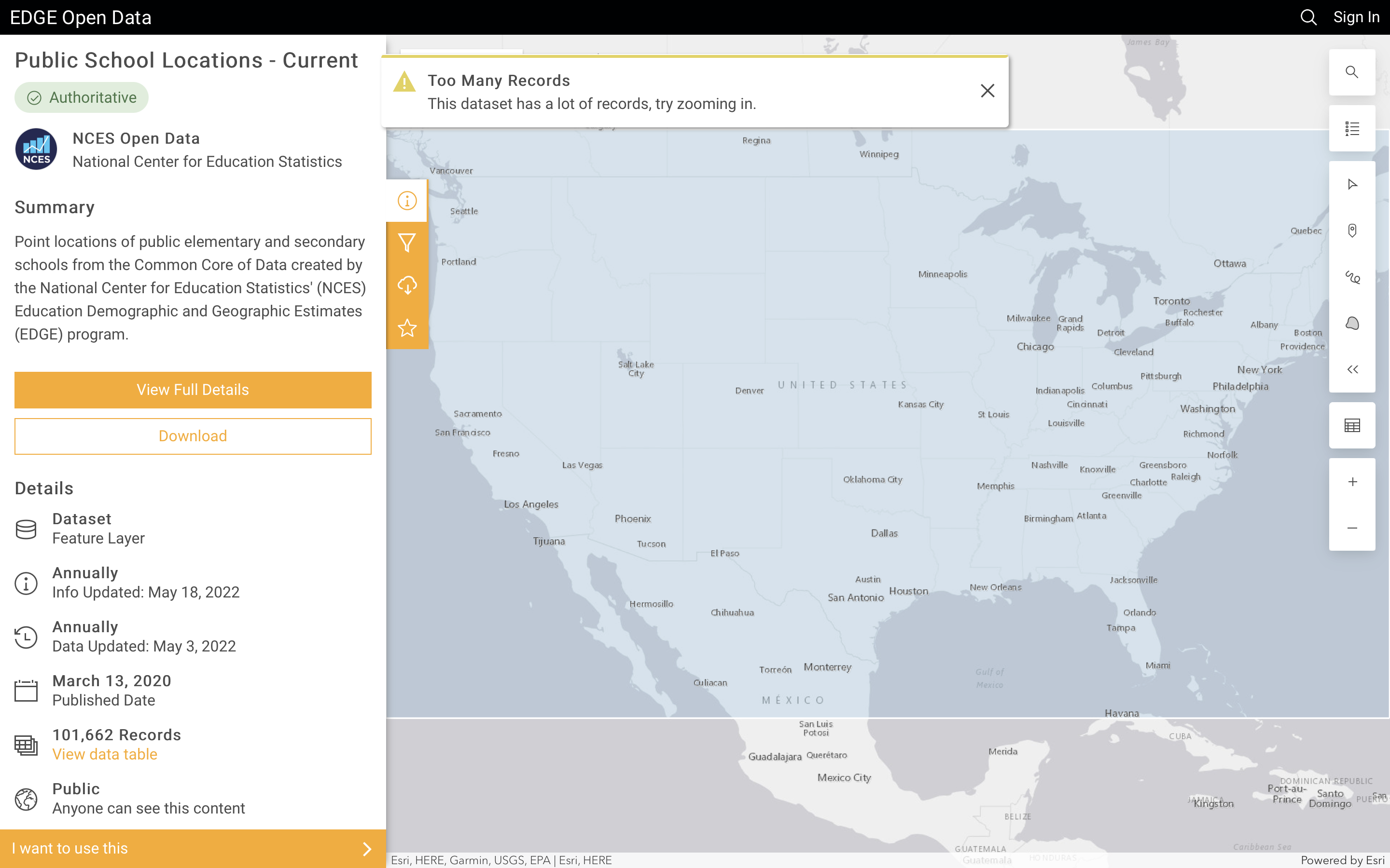{style="height:265px !important; width: 99%" fig-alt="The screenshot shows a left-hand sidebar menu with a summary section, describing the dataset. Below that on the sidebar is a details section, which provides some metadata about the dataset illustrated on the page. To the right is an interactive map of the United States. Over the map is a gigantic opaque box and an alert that reads \"Too Many Records\". At the bottom of the left-hand sidebar is a highlighted button that reads \"I want to use this.\"" fig-align="center"}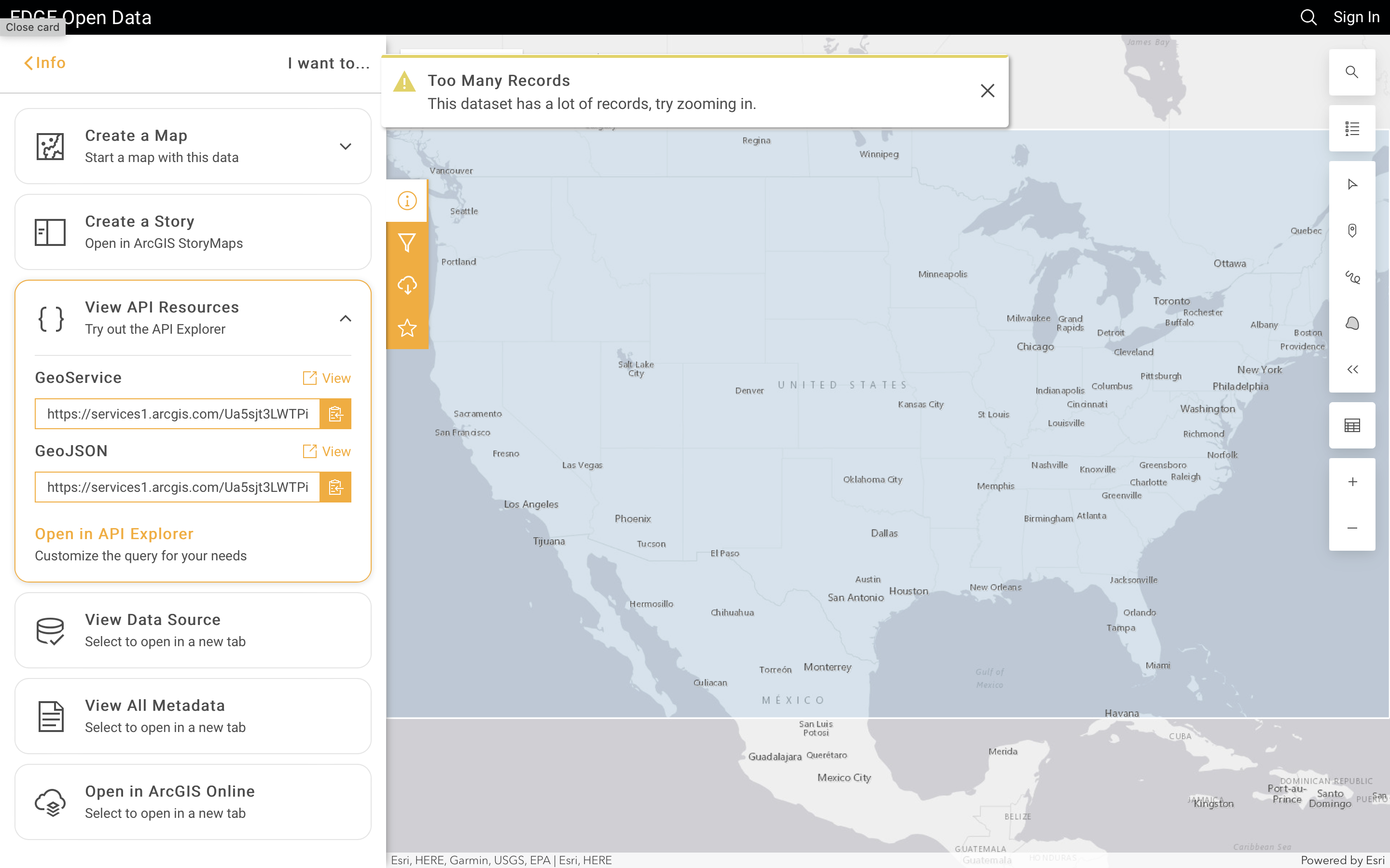{style="height:265px !important; width: 99%" fig-alt="The screenshot shows a left-hand sidebar menu of different options to allow the user to \"use\" the data. In the middle is an expanded button that reads \"View API Resources\". Inside the expanded button are two urls labeled \"Geoservice\" and \"GeoJSON\"."}:::Once you've copied this code, you can read that spatial data *directly into R* with a function called `read_sf()` from the `{sf}` package. [If you're not familiar with `{sf}`, it's what convinced me that, for the rest of my life, I never needed to pay for GIS software.]{.aside} Once you read that url into `read_sf()`, you can drop any empty spatial data from the `geometry` column (where all the spatial coordinates live for each dot) and then give the map a standard CRS to use across all dots.Here's what this looks like as code, and it's just seven lines of code. You run this, you get the data, and now you're ready to move on.``` rlibrary(tidyverse) # Core R Toolslibrary(sf) # Core Spatial Package. Pretty much replaces ArcGIS for most spatial tasks.sf::sf_use_s2(FALSE)url <-"https://services1.arcgis.com/Ua5sjt3LWTPigjyD/arcgis/rest/services/Public_School_Location_201819/FeatureServer/0/query?outFields=*&where=1%3D1&f=geojson"data <-read_sf(url) |>drop_na(geometry) |>st_as_sf(crs =st_crs(4326))```At this point, we are ready to map the data. Now, there's lots of spatial packages out there to map with like [`{leaflet}`](https://rstudio.github.io/leaflet/), [`{mapview}`](https://r-spatial.github.io/mapview/) , [`{mapdeck}`](https://symbolixau.github.io/mapdeck/articles/mapdeck.html), [`{tmap}`](https://r-tmap.github.io/tmap/), and [`{leafgl}`](https://github.com/r-spatial/leafgl), but I've recently become a huge fan of an R package called [`{rdeck}`](https://qfes.github.io/rdeck/index.html). I'm partial to it because it's incredibly lightweight and the maps look really great once you've gotten a token from [mapbox studio](https://www.mapbox.com/mapbox-studio "Mapbox Studio welcome page"), even though you don't necessarily need one. [For more on getting a mapbox token, see Kyle Walker's tutorial from his [`{mapboxapi}`](https://walker-data.com/mapboxapi/) R package.]{.aside}So how do we map in [`{rdeck}`](https://qfes.github.io/rdeck/index.html)? Well, let's pretend like you didn't have a mapbox token. You could start by running a code chunk, like the one below, which has two functions from [`{rdeck}`](https://qfes.github.io/rdeck/index.html).The first function, `rdeck(...)` is kind of like the `ggplot()` function. It creates a spatial canvas, which you can modify with a few arguments. In this case, we've articulated that there's no base map, but the overall theme of the map is "light".The second function, `add_scatterplot_layer()` is what we use to add the dots and define characteristics about them. In this case, it just adds the school dots, names the dot series "Public Schools (SY21-22)", and tells it where to get the dots from within our dataset (the column labeled `geometry`)```{r simple-canvas}#| echo: true#| code-summary: "**Show the code** | Build A Basic Map"library(rdeck) # Loads rdeck libraryrdeck(map_style =NULL,theme ="light") |>add_scatterplot_layer(data = school_sites,name ="Public Schools (SY21-22)",get_position = geometry)```<br>### How can we improve this map?The map above is a decent start, but there's a couple of issues to resolve:1. The dots kind of disappear as you zoom in.2. The default bounding box is set more far out than I'd like.3. I also can't really see any information about the schools.4. The lack of a basemap may not be a problem for some maps, but for this one... it's just not great.To fix this, we just add a few arguments to each of the two functions used in the previous code chunk.#### Styling our dotsFirst, I'm going to style the dots. They look cool from far away, but appear to dissolve once you zoom in. This is the opposite of what we want if our goal is to let people explore the US and identify schools across the country. So, to fix this, we can use a couple of arguments within the existing `add_scatterplot_layer()` function.We start by setting a minimum pixel size for the dots using `radius_min_pixels`. Leaving it blank will mean there's no minimum as people zoom in. Setting it to `1` or `2` pixels will mean people will see a dot equivalent to those sizes no matter how far they zoom in.I'm also going to make the dots burnt orange, cause I'm a UT Austin alum 🤘 and think it's a great color 😂. Lastly, I'm going to set the opacity of the dots. There's some other arguments within the function you can play with, but I feel pretty good about these dots. They are visible and big enough to hover over with a mouse.At this point, we only need to add a basemap, tooltip, and bounding box so the map doesn't render so far out (leaving a lot of white space).```{r add-the-dots}#| echo: true#| code-summary: "**Show the code** | Styling The Dots"rdeck(map_style =NULL,theme ="light") |>add_scatterplot_layer(data = school_sites,name ="Public Schools (SY21-22)",get_position = geometry,get_fill_color ="#bf5700",radius_min_pixels =2,opacity =0.3)```<br>#### Adding a tooltipAdding a tooltip is actually pretty easy and the pre-built tooltips are quite nice. In my code chunk, I'm going to adjust the existing data argument already set to our `school_sites` object and select only the `Name` and `Location` columns. They're named differently, but I can rename them with `school_sites |> select(Name=NAME, Location = NMCBSA)`. After this, you add a `tooltip` argument to define what columns you want. A nice feature of the `tooltip` argument is that you can use [tidy-select](https://dplyr.tidyverse.org/reference/dplyr_tidy_select.html) syntax to build your tooltip. Lastly, I add `pickable = TRUE`, which just means that the dots will respond as I move my mouse/trackpad around the map.If you want, you can add some CSS afterwards, but it's [a little complicated to adjust](https://github.com/qfes/rdeck/issues/61) and the default tooltips are easy to set and look good. Alright, onto basemaps and bounding boxes.```{r add-the-tooltip}#| echo: true#| code-summary: "**Show the code** | Adding A Tooltip"rdeck(map_style =NULL,theme ="light") |>add_scatterplot_layer(data = school_sites |>select(Name=NAME, Location = NMCBSA),name ="Public Schools (SY21-22)",get_position = geometry,get_fill_color ="#b57000",radius_min_pixels =2,opacity =0.3,tooltip =c(Name, Location),pickable =TRUE)```<br>#### Adding a basemapAdding a basemap is easy once you get your token setup. Instead of setting `map_style = NULL` inside the`rdeck()` function we're currently, we just use one of the options from mapbox built into `rdeck`. For demonstration purposes, I'll use a style from mapbox called "Le Shine" by setting `map_style = mapbox_gallery_le_shine()`. In the original map, we use a style called "Minimo", which I like and think works well to contrast basic geographic markers alongside the kind of dots we're trying to visualize.Next up, bounding boxes!```{r add-the-basemap}#| echo: true#| code-summary: "**Show the code** | Adding A Basemap"rdeck(map_style =mapbox_gallery_le_shine(),theme ="light") |>add_scatterplot_layer(data = school_sites |>select(Name=NAME, Location = NMCBSA),name ="Public Schools (SY21-22)",get_position = geometry,get_fill_color ="#b57000",radius_min_pixels =2,opacity =0.3,tooltip =c(Name, Location),pickable =TRUE)```<br>#### Adding a bounding boxHonestly, this one is kind of tricky and might be the least intuitive part of `rdeck` because the argument that controls this `initial_bounds` requires an object of `st_bbox`, `sf`, `sfc` class. The end result spits out a box of coordinates that looks like this:``` r xmin ymin xmax ymax -106.6458525.83706-93.5078236.50045```The disclaimer here is that you don't have to set a bounding box to adjust the view, but it certainly helps if you want to direct your audience to a specific location. I sort of hacked my way through this by piece-mealing a frankestein function of different things I found online called `get_bbox()`, largely based on [Bob Rudis](https://twitter.com/hrbrmstr)' `{nominatim}` package. I've folded the code here, but feel free to look at if you want. The bottom line is it works, so just steal it and use it to get the bounding box you need for this argument.```{r create-a-bounding-box}#| echo: true#| code-fold: true#| code-summary: "**Show the code** | Adding a Bounding Box"get_bbox <-function(place) { df_bbox <- nominatim::bb_lookup(place) btlr <- df_bbox[1,c("bottom", "top", "left", "right")] v <-as.numeric(btlr) cmat <-matrix(v[c(3, 3, 4, 4, 1, 2, 1, 2)], nrow =4) spobj <- sp::SpatialPoints(coords = cmat) sfobj <- sf::st_as_sfc(spobj) sf::st_crs(sfobj) <-4326 bbox <- sf::st_bbox(sfobj) bbox}texas_bbox <-get_bbox("Texas")```In my case, I'm from Texas. I love Texas. And I want to focus the map on Texas. Not just cause I love it and am from here, but Texas is home to a significant chunk of America's school-aged children. Of the reported [49.5 million](https://nces.ed.gov/fastfacts/display.asp?id=372) children enrolled in US public schools, Texas accounts for over [5.4 million](https://rptsvr1.tea.texas.gov/cgi/sas/broker?_service=marykay&_program=adhoc.addispatch.sas&major=st&minor=e&charsln=120&linespg=60&loop=1&countykey=NO&oldnew=new&_debug=0&endyear=22&selsumm=ss&key=TYPE+HERE&grouping=e+&format=W "Texas Education Agency | PEIMS Student Enrollment Figures") of them. So, I'm going to pass the result of my `get_bbox()` object into the `initial_bounds` argument of the `rdeck()` function, which will set the starting point to Texas.```{r all-together-map}#| echo: true#| column: page#| fig-height: 6#| code-summary: "**Show the code** | Putting It All Together"rdeck(map_style =mapbox_gallery_minimo(),initial_bounds = texas_bbox,theme ="light") |>add_scatterplot_layer(data = school_sites |>select(Name=NAME, Location = NMCBSA),name ="Public Schools (SY21-22)",get_position = geometry,get_fill_color ="#bf5700",radius_min_pixels =2,opacity =0.3,tooltip =c(Name, Location),pickable =TRUE)```<br> And that's it! If you have any questions, revisions, or suggestions, just shoot me a message [on twitter](https://twitter.com/mrworthington).## Acknowledgments {.appendix}Photo by <ahref="https://unsplash.com/@andrewtneel?utm_source=unsplash&utm_medium=referral&utm_content=creditCopyText">Andrew Neel</a> on <ahref="https://unsplash.com/s/photos/maps?utm_source=unsplash&utm_medium=referral&utm_content=creditCopyText">Unsplash</a>

